PICCS, Child Care and Family Centre
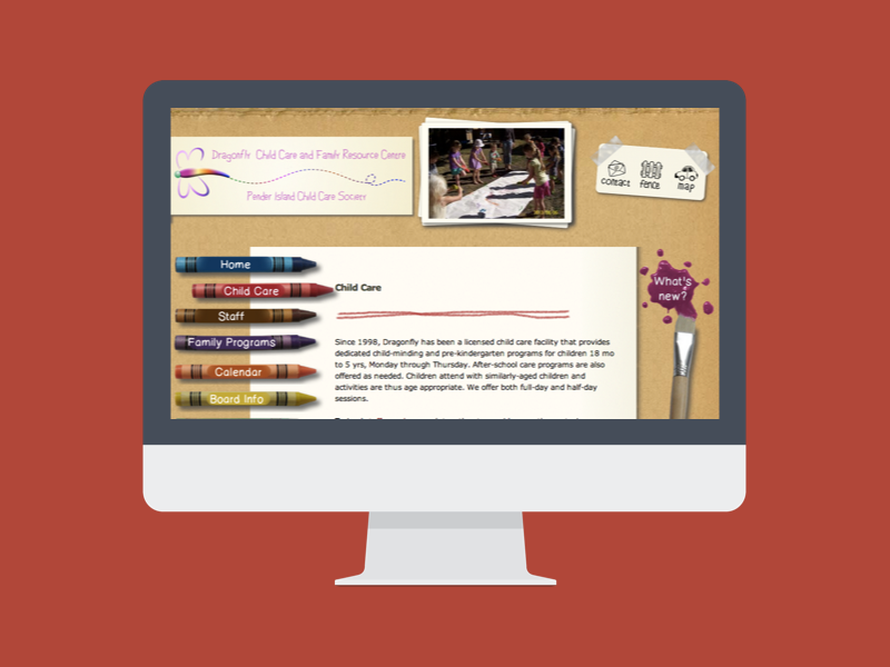
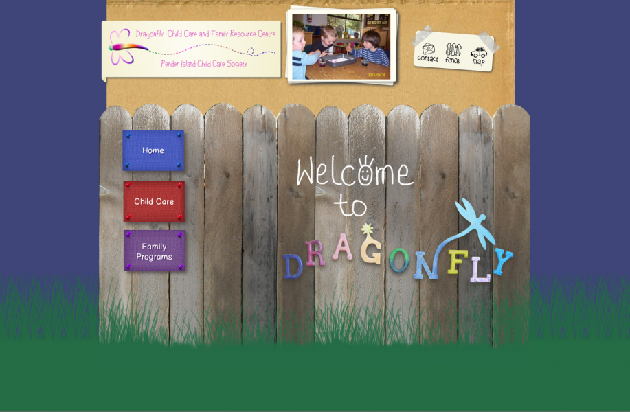
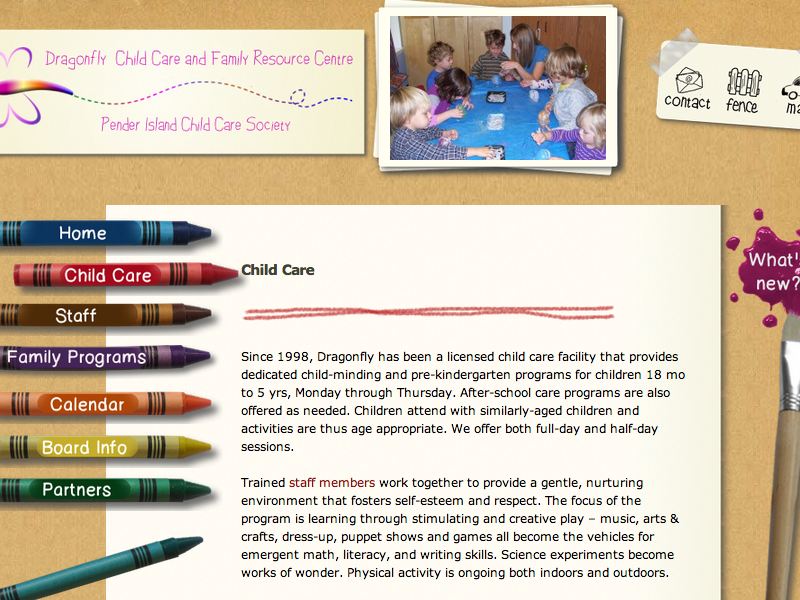
The Dragonfly Child Care and Family Centre or PICCS on Pender Island was looking for a website that enabled them to communicate their mission statement, describe their programs, and published their events. We felt the design had to reflect characteristics of a child care centre in general, and elements of the Dragonfly Child Care Centre in particular. Therefore, the colour scheme that was used here were basic colours on a neutral background. The design elements all reflected items that can be found in a child care centre (crayons, brushes, little bits of paper, paint blobs etc.). As a very personal touch we decided to add a front page as an entrance with the same lettering as the original entrance of the centre in order to achieve a high level of recognition among the site users.
However, it was important to keep easy navigation and a clear overview in mind, so we added a lot of white space. We also colour coordinated the content of one page with the respective crayon. The active page is emphasized with a slightly indented crayon.
Expertise
- Apr 4, 2012
- PICCS, Child Care, Pender Island


