Maple Cove Cabin, Pender Island
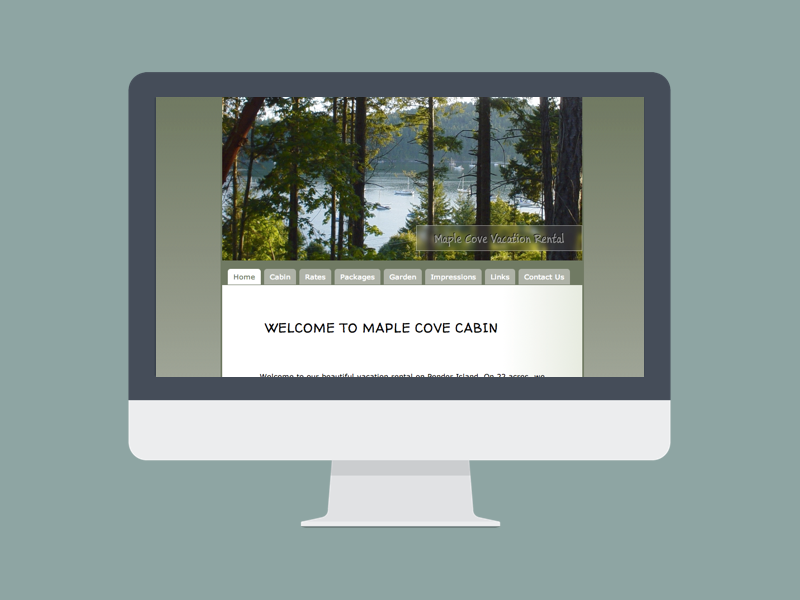
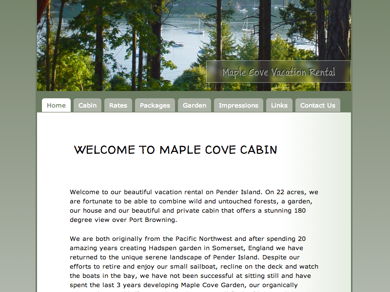
The owners of this amazing vacation rental on Pender Island are garden designers with a focus on colour. Therefore, it was clear from the beginning that colour schemes were an important element in this design process. The Popes put a big effort in designing their property in harmony with the landscape that surrounds them. Therefore, we felt that their website had to reflect this pardigm. We chose an almost monochromatic colour scheme that contained various shades of greys and green. Those of us who were fortunate enough to have had visited Pender will know that this is one of the dominant colours on a forrested property.
Another important part of this design project was simplicity and easy navigation. Therefore, we included a lot of 'white space', space without content, in order to achieve a clean look. Also, content was organized in clearly separated paragraphs and tables. Imagery was used pointedly without interfering with the overall paradigm of a clean, monochromatic web page layout. We decided to use a navigation that was organized as tabs underneath the main image to make it a very user-friendly page, as not all customers who are looking for a relaxing vacation are necessarily also tech-wizards.
Expertise
- Nov 30, 2011
- Maple Cove Cabin


